Part One:
Blindness by Jose Saramago

The cover of Blindness is really interesting. The design in a way corresponds with the idea and tones set in the novel. The black haze in the center represents the idea of blindness. The white background is simple yet also contrasts well with the black. Blindness in Blindness is a milky white substance that blocks the eye from seeing. The multitude of the word blindness overlapping each other represents confusion and mass of disarray much like the theme in the novel.
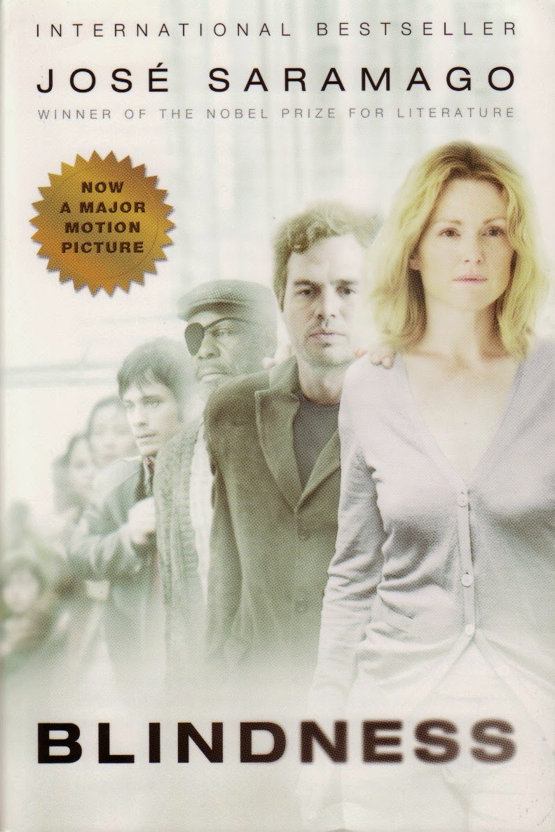
I think this book cover was inspired from the movie. I prefer the previous cover because I don't like when books give me the face of the characters. But these characters do represent the character description well I guess. However, the pictures don't really enhance the book. It just shows characters and has no further meaning in relation. The colors are nice though.
Part Two:


- Do you see the design concepts and components like Typography, Images/Graphics, Proximity, Alignment within the work?
They all have a good structure to their novel. Most of the text is centered in the middle bottom or cascades downward. Especially the one with the circles. The circle has even proximity for everything. From text to the circle. All the covers are neat and organized, spaced evenly apart. They all incorporate some image from cucumber to milk.
- Think about why you were drawn to this book cover. What made you take a closer look?
The reason I was drawn to these covers was probably because of the images they had. Especially the milk and the cucumber. I like those especially. The lightbulb attracted me because of its simplicity. The last two had nice similar colors and a unique formatting.
- With the 5 you chose, what are some common characteristics between them? What are the difference?


