Sunday, December 21, 2014

Typography


1. You must identify which category the type is under
2. Where and what was the type used for?
3. Do you find the typeface to be appropriate for its purpose?


1. Slab Serif
2. Location: school
    Purpose: Poster
3. It's a simple design that works well with the concept. It's not overdone which is appropriate for the message the poster expresses


1. Script
2. Location: School
    Purpose: Poster
3. In my opinion, a decorative font would have been the better option. The font does not enhance the meaning but it is still a nice looking font
1. Sans Serif
2. Location: School
    Purpose: Poster
3. It's basic but acceptable. The decoration and color enhances the idea so the font is fine as it is
1. Modern
2. Location: Library
    Purpose: Book
3. I see no harm in using a Modern Font in this display


1. Old School
2. Location: Library
    Purpose: Logo design on box
3. It is deemed appropriate as it is simple and goes well with the concept

1. Decorative
2. Location: Library
    Purpose: Book
3. I'm uncertain whether the design is appropriate as I have never read the book before. However it is a unique font which I like

Wednesday, December 17, 2014

Cooking Club Summary Q&A


Q&A

Interview #1:
1. What object best represents your club? List a few images
Food, knives

2. 5 words that best represent the club
Yummy, Work, clean, messy, injury

3. Are there any colors that represent the club?
Rainbow

4. What is the main goal/ purpose?
To learn how to cook

5. Tools or resources
Recipes, ingredients, utensils, sink, hot stove

6. Hardships/ success/ strengths, weaknesses?
Weakness- Injuries
Success- Good Food

Interview #2: 

The goal of cooking club is to practice skills of cooking and to have fun with it. Make good food by trying new recipes and include healthy and filling ingredients. It is really just for fun. It is not guided by me, but rather by the participants. 

Summary
Cooking Club is run by one teacher with many hungry students. Meeting once a week, a recipe is given to the students with the ingredients needed. In preparation, food needs to be cut (ex: Fruits, vegetables, meat), cooked (meat, egg), mixed (spices), and other various necessities. Injuries have occurred during the events such as cuts in the skin and burns. However in the end result many amazing food has been made from chicken to tacos to ice cream. During these sessions, kids learn new recipes, new techniques and new food. There's always a mess at the end with dirty dishes and pans but it is worth it. 


Logo Concept Board


Monday, December 15, 2014

Favorite Logo

Skype Logo


Skype has a very simple and basic logo but even so it has a nice design. When you see the logo, it is obvious what it represents, Skype. It has a simple white and blue color, nothing to extreme. The cloud outline adds a significance to the logo that represents the company.

Veterinaire Logo

The logo is extremely creative and really incorporates the message and purpose of the company. From looking at the design and name, it must represent some form of vet or other associations with animal. Three distinct animals are seen using the contrast between white and blue. The colors are simple and nice. Overall the idea is clear, easy and memorable.

Monday, December 8, 2014

Portrait Transformation

Before
Process: Taking the person and putting her on a mountain background.
Concept: Mountain climber. I believe the portrait transformation was successful. The photo seems real enough. The flag adds in the concept of a mountain climber reaching the top. The contrast and lighting of her face matches well with the background making the photo more realistic.

After

Tuesday, November 18, 2014

Shape to Symbol GIF Reflection


1. While using Photoshop, what was the most frustrating aspect of the program and/ or project?
Using Photoshop for the first time for a project, the most frustrating aspect must have been the difficulty in finding specific tools and options. Photoshop has a wide variety of options and tools making it hard to find a tool that is actually needed. For example, it took a long time to find the shape tool which allowed me to do the "pow" design in my GIF. 

2. After completing the project, which tools do you feel most confident in using?
Among the large variety of tools, the most confident I feel in using is the paintbrush tool because it is generally in many other programs like Paint so I am used to it. However Photoshop allows for a larger choice in option of brush and size which was fun to play around with. Also I have grown accustomed to the eyedropper tool. The eyedropper tool is really simple to use yet really beneficial to get the same color which saved a lot of time.

3. Which tool do you wish you were better at using? Why?
I wish I was better at using the Marquee Tool. The Marquee tool has so many options to choose from, from deselection, add to selection, subtract selection and intersect with selection. Although we had a lesson on the tool, it is still hard to use. If I was better at using the Marquee, I think I can make my GIF cleaner and add in different details.

4. What would you like to create next with Photoshop?
For the next project using Photoshop, I would like to create logos or advertisements because in Yearbook we are learning a similar concept. I would like to be able to improve on my Photoshop skills by doing projects on logo and advertisements so I can apply it to my Yearbook class. Also creating logos is really fun! 

DRAFT: THUMBNAILS


Monday, October 20, 2014

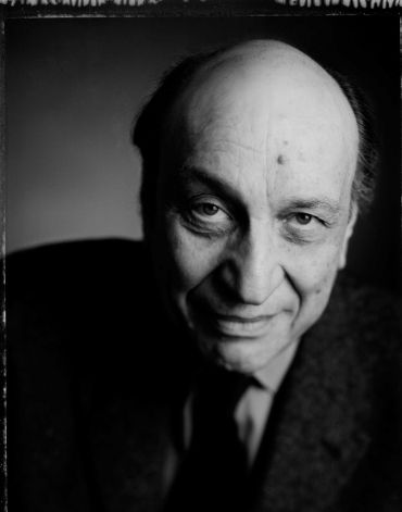
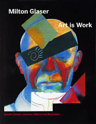
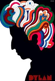
Milton Glaser: A Non-Bread Baker but a Graphic Designer


  • Milton Glaser: Was the creator of the I <3 NY logo that we see everywhere around New York. It’s first off amazing to see the creator and to see how his design is so simple yet so renowned. Many of his designs is founded throughout New York too, having created designs for restaurants at the World Trade Center. His works are feature throughout New York. Milton Glaser is interesting to study because he has such a large impact on New York City.  

How has Milton Glaser impact the graphic design world?
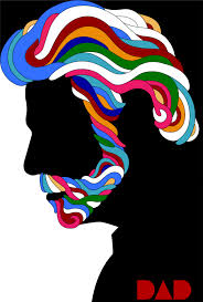
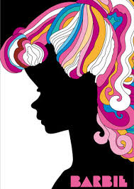
Milton Glaser embodies American graphic design during the latter years of the century. He impacted the graphic design world with his formidable, creative and articulate designs, bringing depth of understanding and conceptual thinking to an international level. Also Co-founder of Push-Pin Studios which has exerted a powerful influence on the direction of the graphic design world.

  • Creator of I <3 NY Logo
  • Simple, Clear, Direct

  • 1954 co-founded Push-Pin studios
  • Influences:
    • Herbert Bayer- Brought European ideas to the U.S
    • George Salter- Glaser’s teacher
    • Lester Beall- Consistency, graphic rigor, intelligence
    • Paul Rand- Ongoing, universal, non stylistic value,
    • Joseph Baum- Client of Glasers’