At a shop: The cashier goes "Ni hao" and grabs a red bag instead of the normal black ones they use. He proceeds by saying, "cause your Asian and red is good luck for you", or something along those lines.
I find microaggression amusing more so than offensive or aggravating depending on the context and tone used. A common example of microaggression is, "Where are you from?" in which they mean which Asian country do you originate from even though you were born in America. However, I find that genuinely okay to ask others in the respect that they are curious of the origins as oppose to an offensive remark. I feel that many people nowadays, purposely try to find some flaws in questions or statements of such so they can pinpoint it as an offensive racial remark instead of a curious inquiry or opinion that it is actually made out to be.
Monday, April 27, 2015
Thursday, March 12, 2015
Book Cover
Part One:
Blindness by Jose Saramago

The cover of Blindness is really interesting. The design in a way corresponds with the idea and tones set in the novel. The black haze in the center represents the idea of blindness. The white background is simple yet also contrasts well with the black. Blindness in Blindness is a milky white substance that blocks the eye from seeing. The multitude of the word blindness overlapping each other represents confusion and mass of disarray much like the theme in the novel.
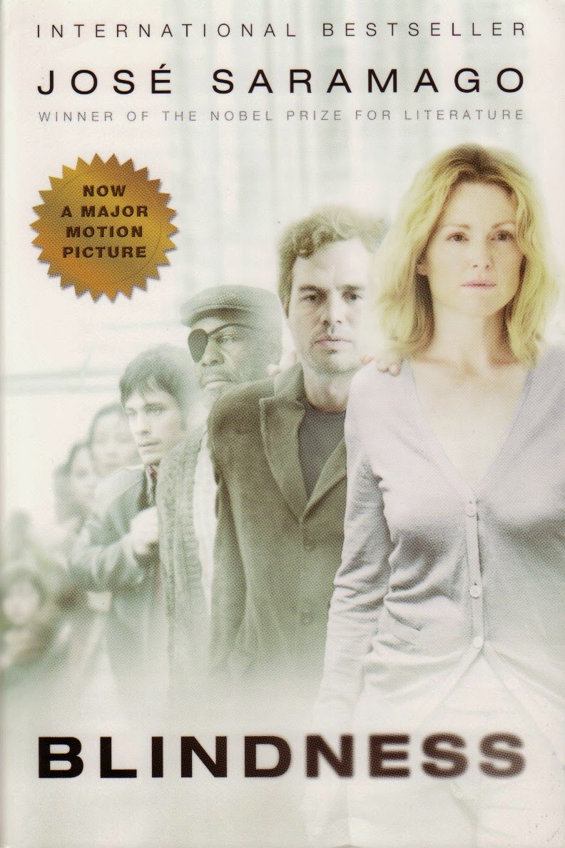
I think this book cover was inspired from the movie. I prefer the previous cover because I don't like when books give me the face of the characters. But these characters do represent the character description well I guess. However, the pictures don't really enhance the book. It just shows characters and has no further meaning in relation. The colors are nice though.
Part Two:


- Do you see the design concepts and components like Typography, Images/Graphics, Proximity, Alignment within the work?
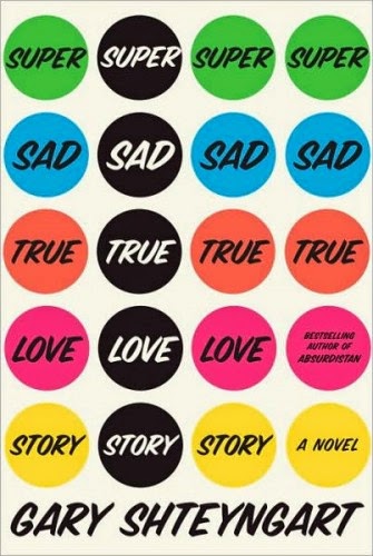
They all have a good structure to their novel. Most of the text is centered in the middle bottom or cascades downward. Especially the one with the circles. The circle has even proximity for everything. From text to the circle. All the covers are neat and organized, spaced evenly apart. They all incorporate some image from cucumber to milk.
- Think about why you were drawn to this book cover. What made you take a closer look?
The reason I was drawn to these covers was probably because of the images they had. Especially the milk and the cucumber. I like those especially. The lightbulb attracted me because of its simplicity. The last two had nice similar colors and a unique formatting.
- With the 5 you chose, what are some common characteristics between them? What are the difference?
Tuesday, March 10, 2015


Thursday, February 26, 2015
Logo Reflectionsssss
1. Answer the following questions and be specific and use design language:
- What was the most challenging aspect of creating your Logo design?
- How did you overcome the challenge?
- What was the most successful aspect of your Logo design?
And that's it!
1a. The most challenging aspect of creating the logo was using Illustrator. As a first time user, it was extremely difficult to use the pen tool which was the most essential tool needed for me to create my design. I had difficulties connecting lines and anchors. I couldn't seem to be able to get the lines to curve at the exact angle I wanted it. It was also hard to create a symmetrical design. Some areas on the left are more curvy than the ones on the right, so it took a long time trying to even things out.
1b. I overcame the challenges by constantly playing around with Illustrator and trying new options and modes out. I stretched areas of my design and moved them around to get a feel of how the pen tool works. After a while, I began to understand the fundamental basis on how the pen tool works and it made creating the design much easier.
1c. The most successful aspect of my Logo design was probably my color choice. At first it was difficult to chose a color since Cooking Club is not really represented by a specific color and most of the colors didn't look good on the design. However later, I realize there was a gradient color option and played around with that. One of the example gradient scale was the orange and yellow blend which conveniently worked with my design quite well.


Monday, February 23, 2015
Mid Winter Break: Whatcha do?
Over the break I spent a large portion of time watching "The Office". I'm on the final season which is exciting and sad. Jim and Pam seem to be struggling in their relationship which is worrisome. They were the perfect couple. Recently I realized many of the relationships in "The Office" fail from Stanley's marriage, Darryl's marriage, etc.
Also near the end of the break I received a text from an unknown number, joining an group chat. They were all congratulating someone for their engagement. I decided to join in and congratulate the women, only for someone to comment who I was. Things got awkward after that and I didn't get a reply back :(
Sunday, February 1, 2015
Art At MOMA
Artist: Laura Owens
Piece: Untitled 2014


1. Where: Where is this artwork? What kinds of artwork were around this piece?
The artwork is located on the 3rd floor of MOMA. I am not entirely sure which exact exhibition room the art was in. However the pieces that surround it were:

2. What about this piece drew your attention? Does it remind you of something else?
There's a simplicity to the artwork. Yet it is unique. I have not seen anything like it before. Owens incorporates words and adds a magnify effect to it. The story written in the text is amusing also. It resembles everyday looseleaf with words with the difference of the shadows that were used to create a 3-d effect. In a sense, it also relates back to the current project we are working on: typography.
3. What do you know about the artwork or artist?
Prior to this encounter, I have never seen the artwork or heard of the artist before. There is not much detail given on the tag next to the artwork either.
Subscribe to:
Comments (Atom)